Tidy Tuesday NHL
Okay, here it is. My first contribution to the my website. I’ll try to make a very quick and simple data exploration analysis for this weeks’ Tidy Tuesday. There are three datasets available. I’m not sure that I’ll be able to analyze all of them… Let’s start from the first top_250.
library(tidyverse)
library(atslib)
library(extrafont)
library(hrbrthemes)
theme_set(hrbrthemes::theme_ft_rc(base_family = "Ubuntu Condensed"))

top_250 <- readr::read_csv('https://raw.githubusercontent.com/rfordatascience/tidytuesday/master/data/2020/2020-03-03/top_250.csv')

top_250
This dataset contains 250 NHL & WHA career leaders and records for goals. First, we’re going to tidy our dataset a bit. What is the most interesting here is total goals really depends on the career length?
The information about years of career contains in years variable. It has a structure of YYYY-YY. First of all, let split it to year_start and year_end.
tidy_250 <- top_250 %>%
  mutate(year_start = str_split(years, "-", simplify = T)[,1],
         year_end = str_split(years, "-", simplify = T)[,2]) %>%
  mutate_at(vars(year_start), ~as.numeric(.)) %>%
  mutate(century = ifelse(year_start < 2000, 19, 20),
         cc = str_split(year_start,
                        as.character(century),
                        simplify = T)[,2],
         cc = as.numeric(cc)) %>%
  mutate(year_end = case_when(
    year_end > cc ~ paste0(19, year_end),
    TRUE ~ paste0(20, year_end)
  )) %>%
  mutate_at(vars(year_start, year_end), ~as.numeric(.)) %>%
  # We need to edit millenials ))
  mutate(year_end = ifelse(year_end < year_start,
                           year_end + 100,
                           year_end)) %>%
  select(player, total_goals, year_start, year_end)

tidy_250
Great! Now we have a very tidy dataframe. However, if we are going to plot career length of all 250 players, it can be a total mess on the plot. Let’s select only first 50 players using dplyr::top_().
tidy_50 <- tidy_250 %>%
  top_n(50, total_goals)
I prefer to use discrete color scale instead of continuous. So I’m going to convert total_goals into factor. I really like to do it interactively with a new questionr package! So easy!
## Cutting tidy_50$total_goals into tidy_50$total_goals_rec
tidy_50$total_goals_rec <- cut(tidy_50$total_goals,
                               include.lowest=TRUE,  right=TRUE,
                               breaks = c(400, 500, 600, 700, 800, 900),
                               labels = c("400-500",
                                          "500-600",
                                          "600-700",
                                          "700-800",
                                          "800-900"))
Okay, so everything is ready for a plot! Please, notice, that I’ve already set the ggplot theme in the first r chunk via theme_set. I prefer to use dark themes everywhere so for this post I’ll also use a dark one. Bob Rudis (hrbrmstr) has created a really nice one in his hrbrthemes.
library(ggalt)
library(paletteer)

tidy_50 %>%
  mutate(len = year_end - year_start) %>%
  mutate(player = fct_reorder(player, year_start)) %>%
  ggplot(aes(x = year_start,
             xend = year_end,
             y = player,
             group = player)) +
  ggalt::geom_dumbbell(aes(color = total_goals_rec),
                size_x = 1.3,
                size_xend = 1.3,
                size = 1) +
  labs(x = "Years active", y = "",
       title = "NHL Career Leaders and Records for Goals",
       subtitle = "TOP 50",
       caption = "Made by @atsyplen as a #TidyTuesday contribution") +
  paletteer::scale_color_paletteer_d(name = "Total goals:",
                                     "wesanderson::Zissou1") +
  theme(panel.grid.major.y = element_blank())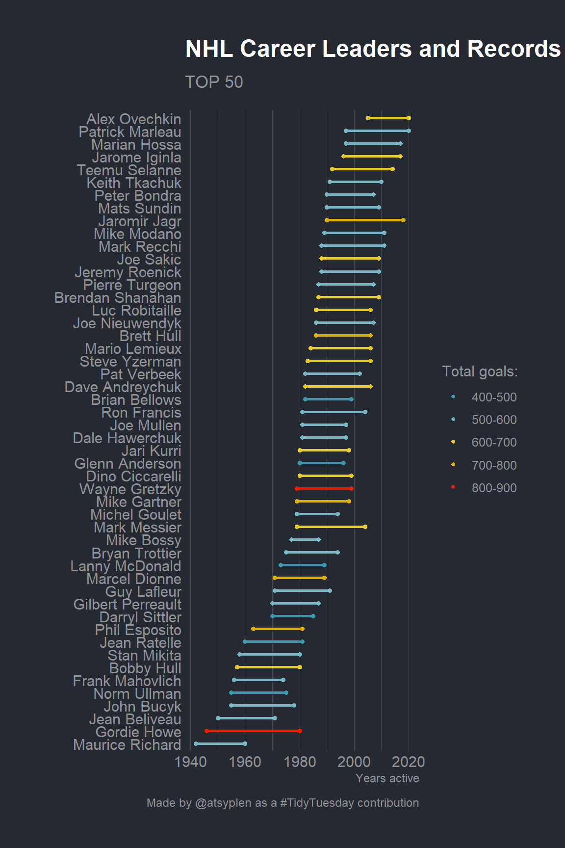
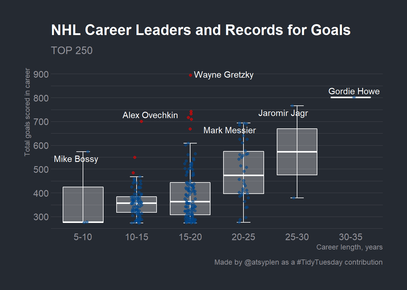
Let’s create a bit more meaningful plot. It’s very interesting how total_goals are spread inside career lengths groups! For this one I’d prefer a boxlplot.
tidy_250 %>%
  mutate(len = year_end - year_start) %>%
  mutate(len = cut(len,
                   include.lowest=TRUE,  right=TRUE,
                   breaks = c(5, 10, 15, 20, 25, 30, 35, 40),
                   labels = c(
                     "5-10",
                     "10-15",
                     "15-20",
                     "20-25",
                     "25-30",
                     "30-35",
                     "35-40"
                   ))) %>%
  group_by(len) %>%
  mutate(outlier.high = total_goals > quantile(total_goals, .75, na.rm = T) + 1.50*IQR(total_goals, na.rm = T),
         outlier.low = total_goals < quantile(total_goals, .25, na.rm = T) - 1.50*IQR(total_goals, na.rm = T),
         outlier.color = case_when(outlier.high ~ "red",
                                   outlier.low ~ "steelblue",
                                   outlier.low == F | outlier.high == F ~ "black")) %>%
  ggplot(aes(x = len, y = total_goals)) +
  stat_boxplot(geom ='errorbar',
               width = .25,
               color = "white") +
  geom_boxplot(outlier.shape = NA,
               color = "white",
               fill = "white",
               alpha = .3) +
  geom_jitter(aes(color = outlier.color),
              width = .1,
              alpha = .6,
              show.legend = F) +
  scale_y_continuous(breaks = seq(100, 900, 100),
                     labels = seq(100, 900, 100)) +
  ggrepel::geom_text_repel(data = . %>% group_by(len) %>%
                             filter(total_goals == max(total_goals)),
                           aes(label = player), segment.colour = "white",
                           color = "white", family = "Ubuntu Condensed") +
  ggsci::scale_color_lancet() +
  labs(y = "Total goals scored in career",
       x = "Career length, years",
       title = "NHL Career Leaders and Records for Goals",
       subtitle = "TOP 250",
       caption = "Made by @atsyplen as a #TidyTuesday contribution") +
  theme(panel.grid.major.x = element_blank())